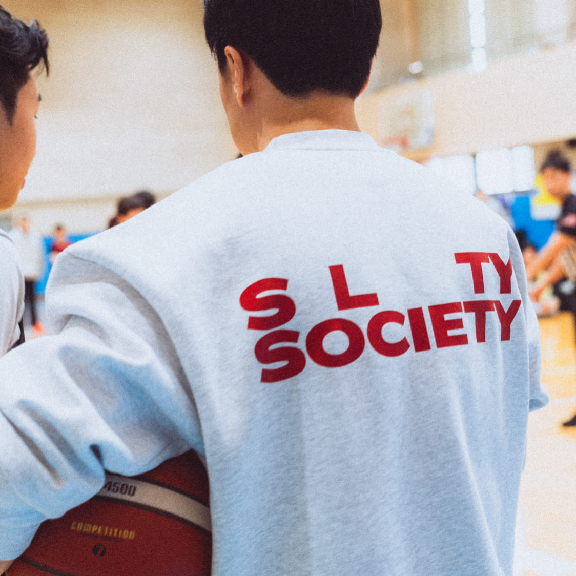
Slty society branding
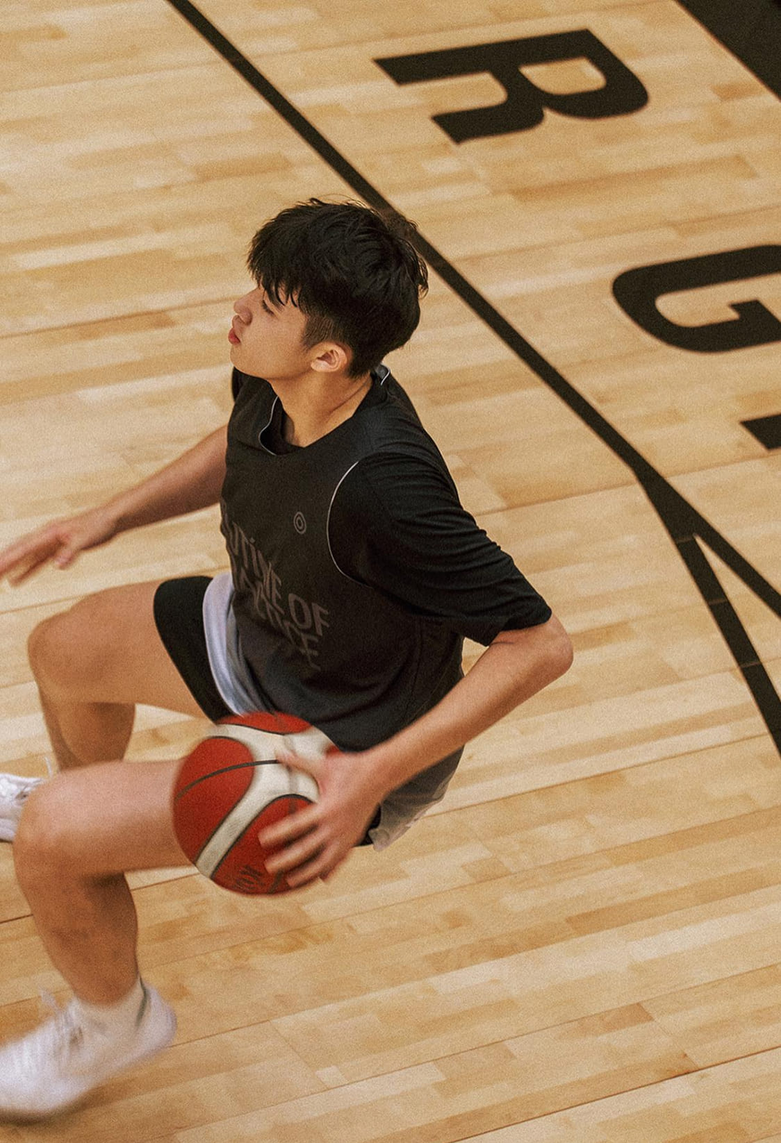
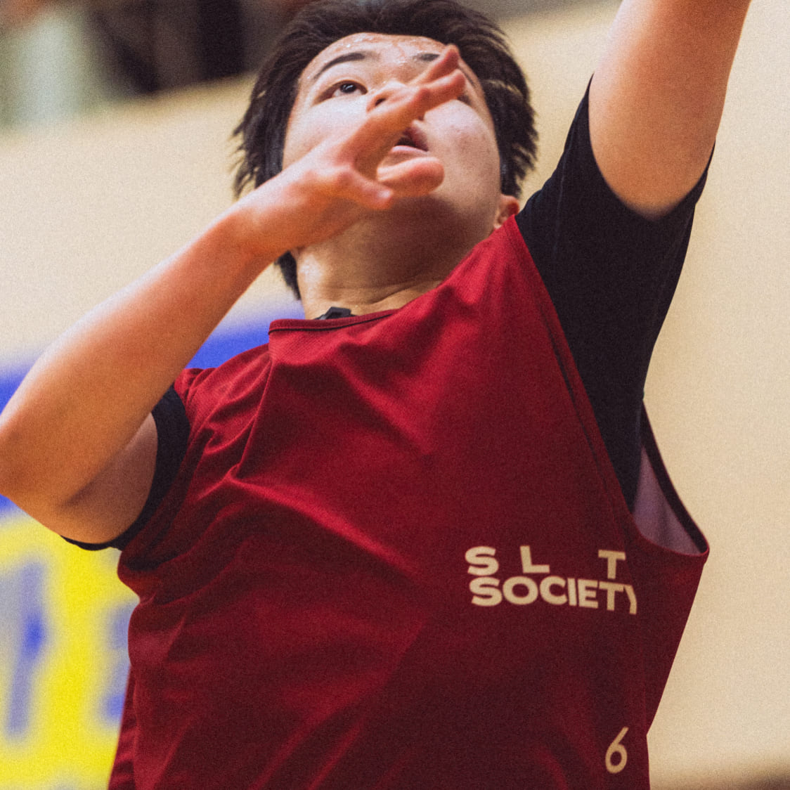
스포츠 의류 브랜드 쏠티소사이어티(Salty Society)의 브랜드 구축 작업을 진행했습니다. 브랜드 전략 수립부터 네이밍, 카피라이팅, 디자인 시스템 개발까지, 브랜드를 만드는 전 과정에 참여했습니다.
쏠티소사이어티는 연습과 땀의 가치를 믿고 실천하는 브랜드입니다. 강도 높은 운동 후, 땀에 젖은 티셔츠 위로 남겨지는 하얀 소금기가 브랜드 네이밍의 모티브가 되었습니다. 이는 끊임없이 도전하고 노력하는 사람들만이 경험하는 순간이며, 이런 경험을 공유하는 커뮤니티를 만들고자 하는 브랜드 철학이 담겨 있습니다.
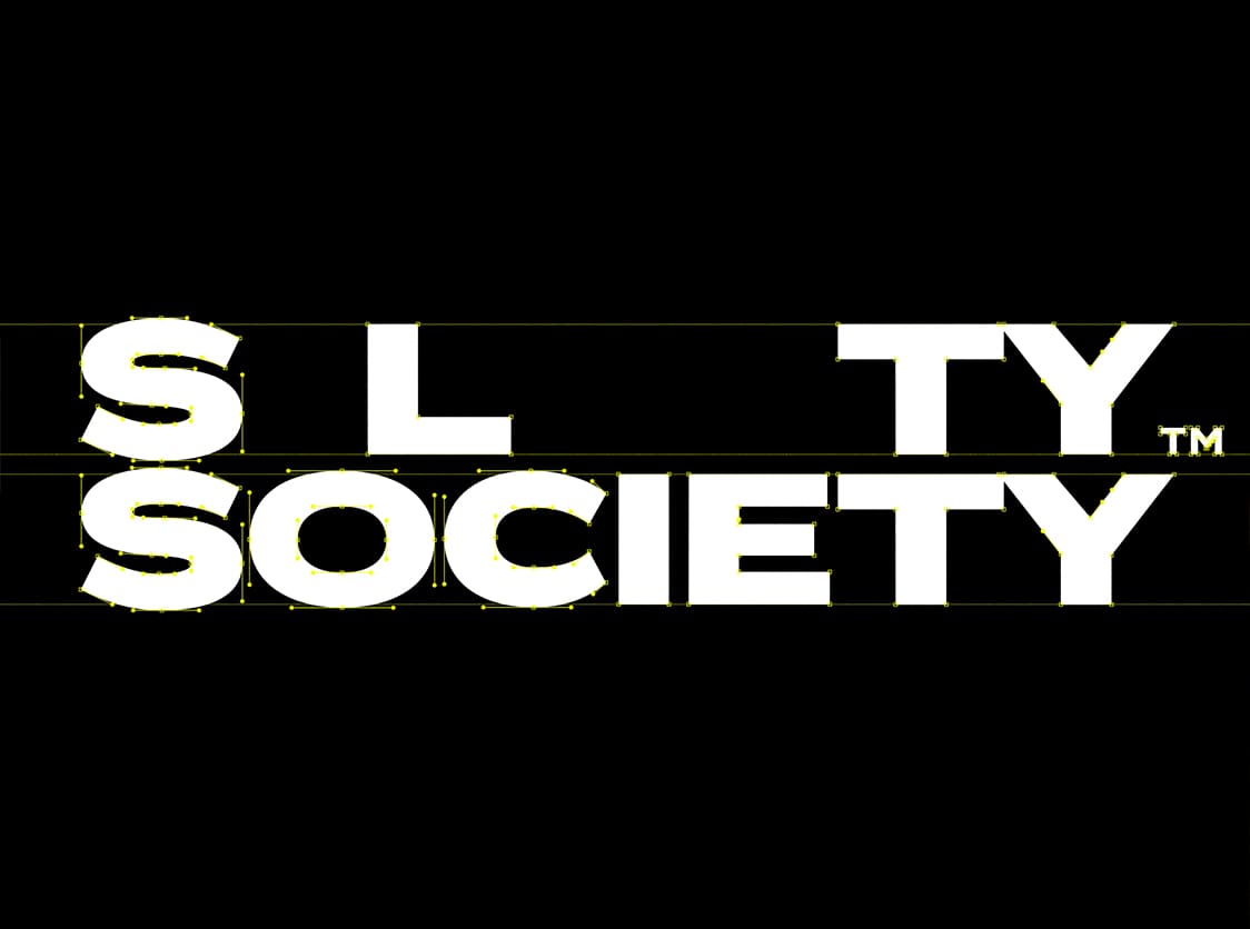
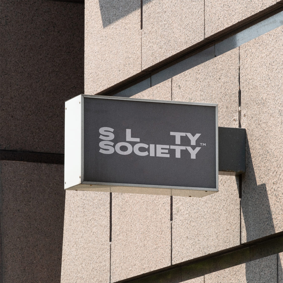
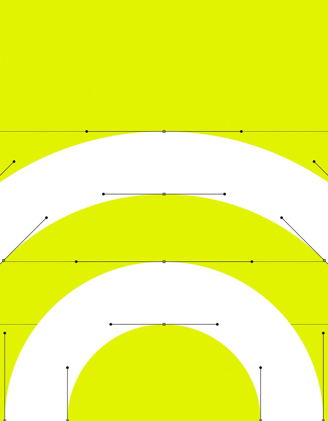
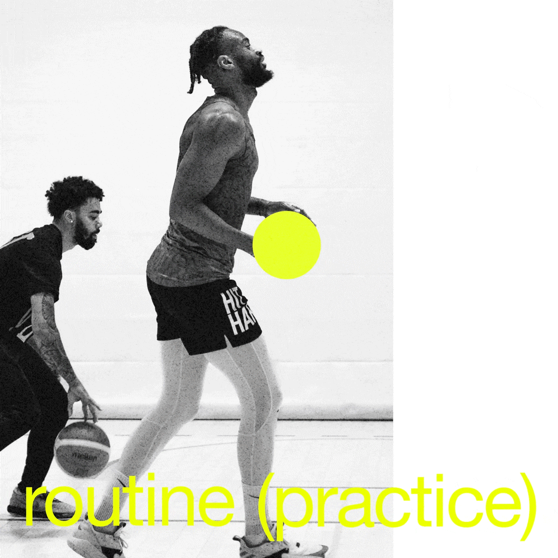
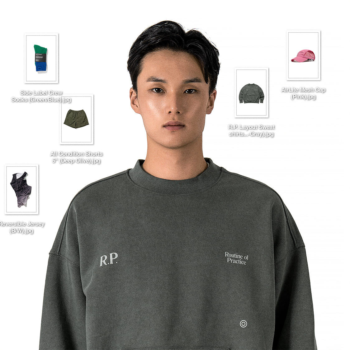
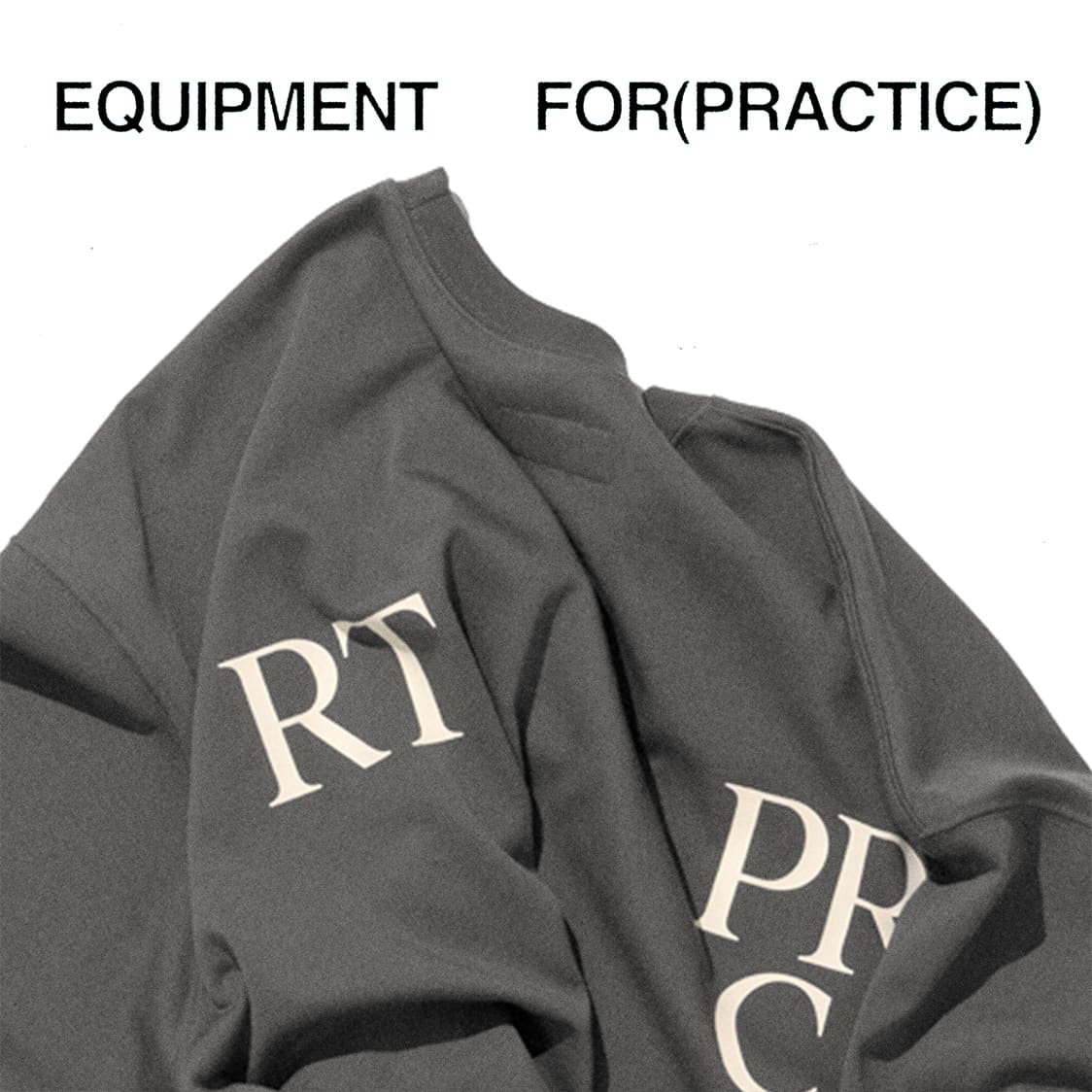
메시지를 강조하는 브랜드의 톤앤매너를 고려해 화이트, 블랙, 옐로우 세 가지 컬러만을 사용한 미니멀한 비주얼 시스템을 구축했습니다. 불필요한 장식을 배제하고, 텍스트의 조합과 배치만으로도 제품을 디자인할 수 있는 가이드라인을 개발하여, 브랜드의 톤앤매너가 제품 디자인까지 일관되게 확장될 수 있도록 설계했습니다.


tedo™ developed the brand identity for Salty Society, a sports apparel brand, overseeing everything from strategy and naming to copywriting and design system development.
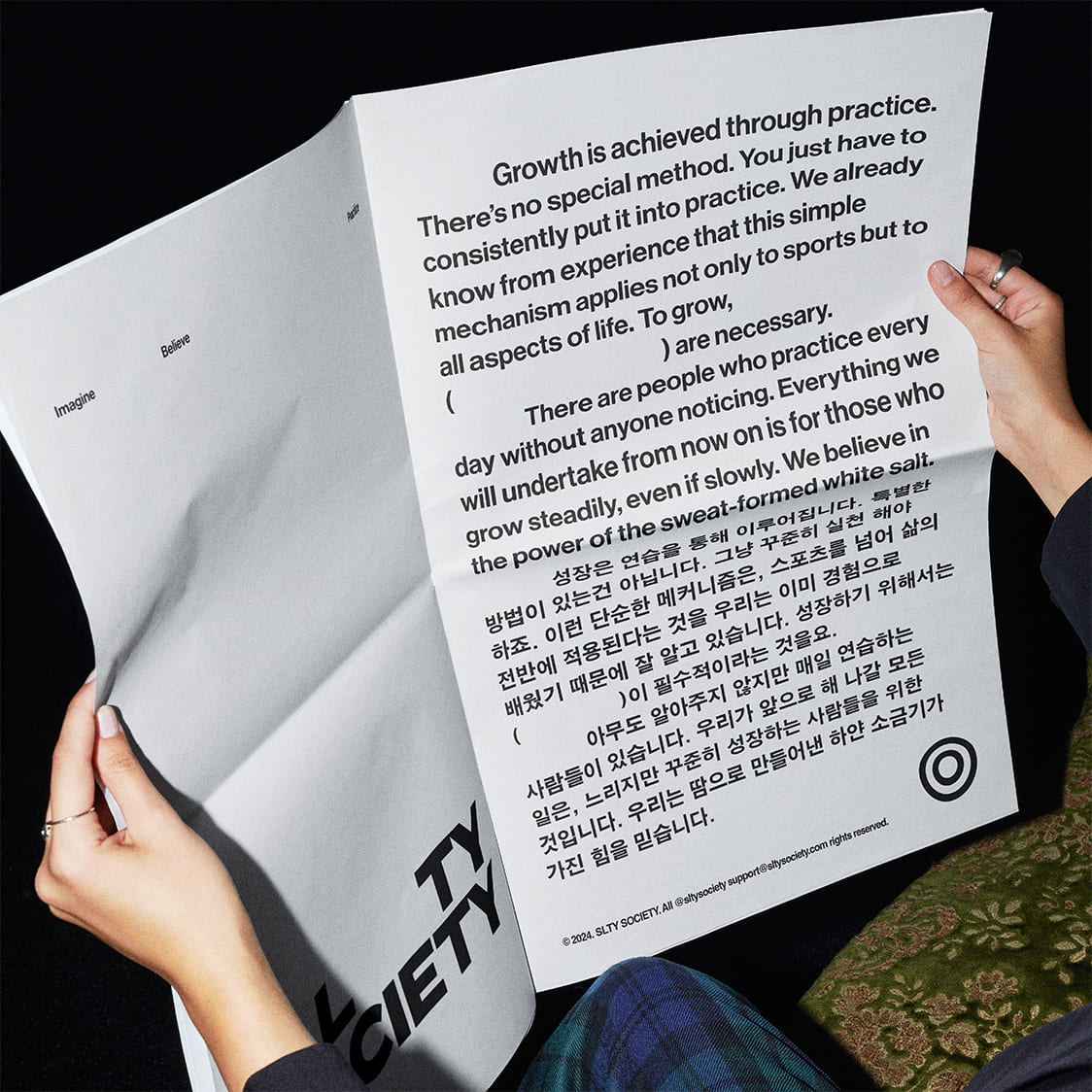
Salty Society is founded on the values of practice and hard work. The name comes from the white salt stains left on a sweat-soaked shirt after an intense workout—a mark only those who push their limits experience. This moment reflects the brand’s philosophy of perseverance and dedication.
To support this bold message, we created a minimal visual system using only white, black, and yellow. By eliminating unnecessary decoration and focusing on typography, we developed a design guide where products can be built entirely through text composition and layout, ensuring a consistent brand identity.