SNUH space branding
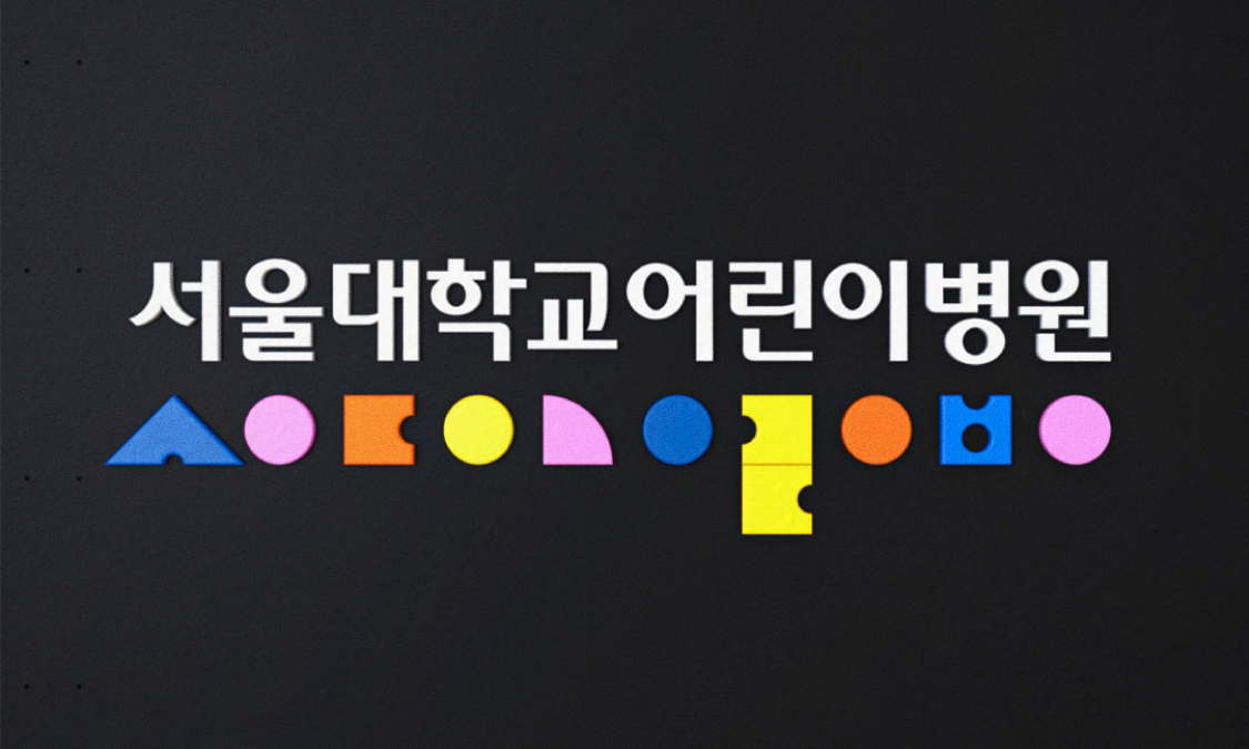
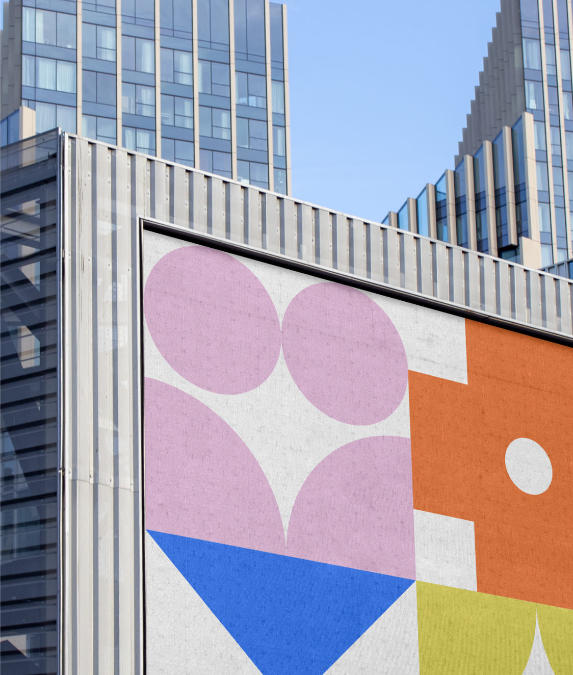
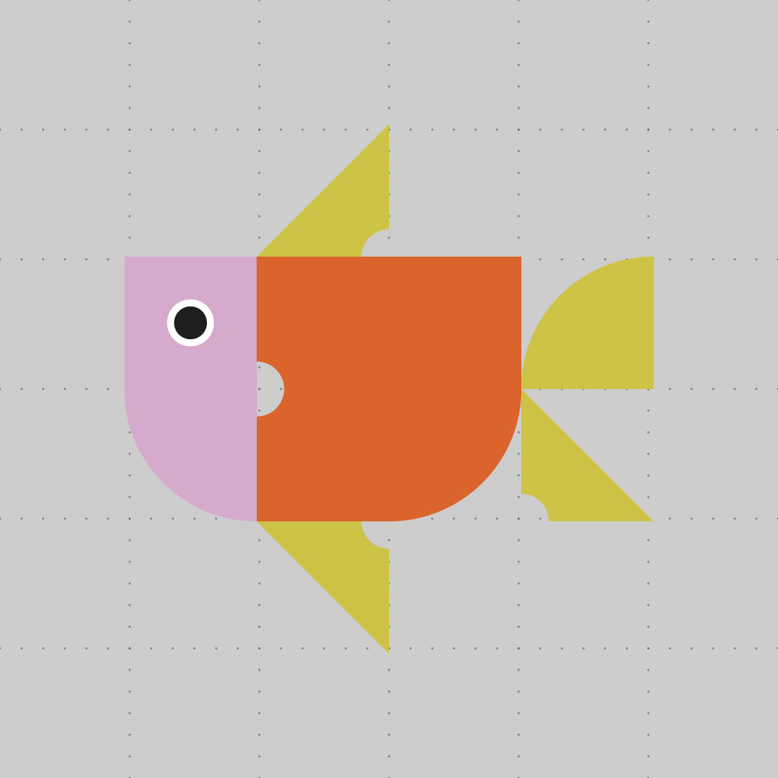
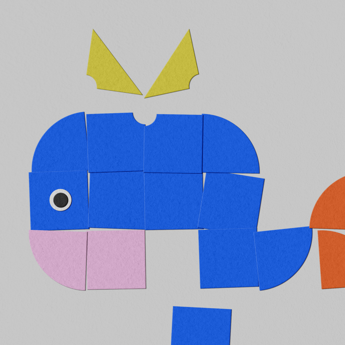
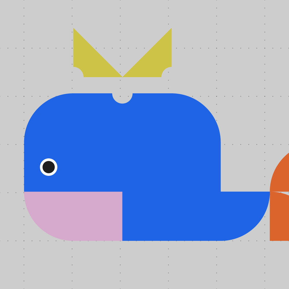
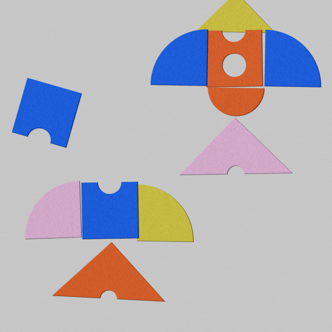
서울대학교 어린이병원의 공간 브랜딩 작업을 진행했습니다. 서울대 어린이 병원은 어린이 친화적인 공간 분위기 조성과 가독성 높은 안내 시스템 구축이 필요한 상황이었습니다. 아이들이 직접 보고 만지고 상호작용할 수 있도록, 블록 놀이, 종이 놀이, 퍼즐 놀이 등 어린이들이 익숙하게 즐기는 놀이 요소에서 영감을 받아 ‘모듈(Modular System)’을 핵심 컨셉으로 설정했습니다.

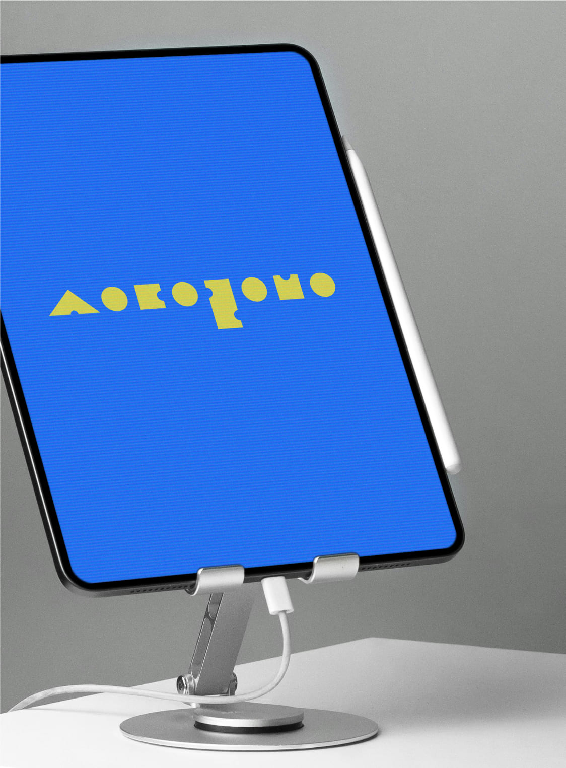
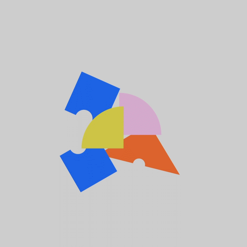
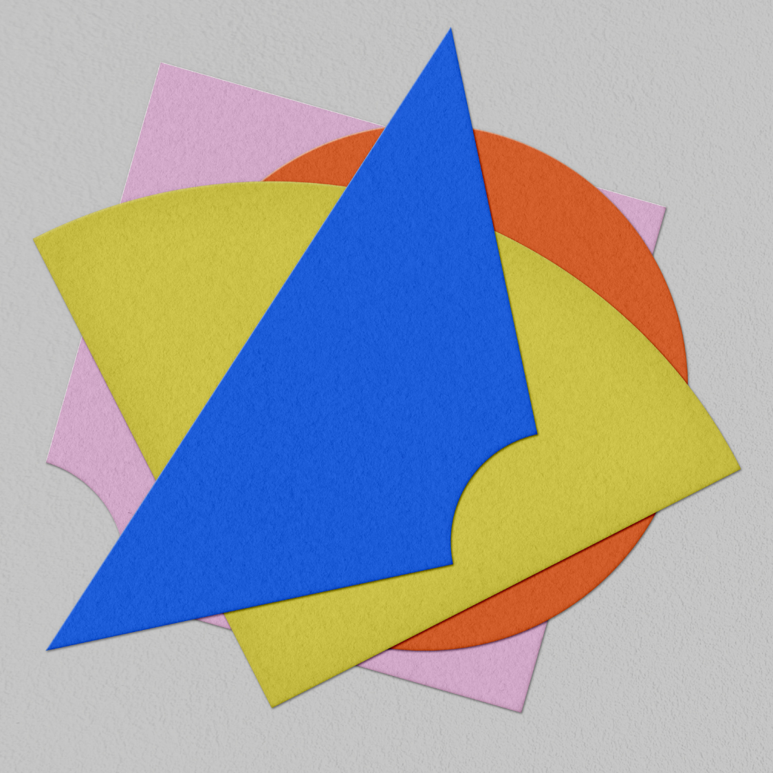
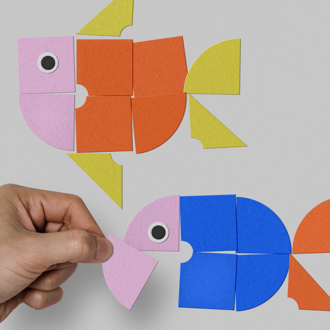
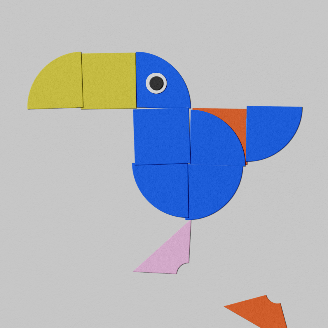
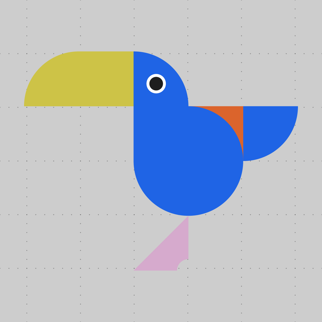
tedo는 서울대 어린이병원의 초성 자음을 단순화하여 기본 모듈을 개발하고, 이를 조합해 다양한 형태로 확장 가능한 모듈 시스템을 구축했습니다. 이 시스템을 활용하면 물고기, 로켓, 꽃, 앵무새 등 어린이들에게 친숙한 비주얼 요소를 무한히 만들어낼 수 있습니다. 또, 해당 모듈을 병원 내부의 사이니지(Signage), 안내자료 등 다양한 공간 요소에 적용하여, 단순한 장식적 요소를 넘어 실제 기능적 역할을 수행하는 브랜드 시스템을 완성했습니다.

We developed the space branding for Seoul National University Children's Hospital, focusing on a child-friendly environment and a clear, easy-to-navigate signage system. Drawing inspiration from familiar play activities like building blocks, paper crafts, and puzzles, we introduced a modular system as the core concept, encouraging kids to see, touch, and interact with their surroundings.
tedo™ simplified the hospital’s Korean initials into basic modular shapes, which can be combined and expanded into playful forms like fish, rockets, flowers, and parrots—making the visuals more engaging and familiar for children. The modular system was applied to signage, wayfinding materials, and other elements throughout the hospital, serving both decorative and functional roles to create a more welcoming and interactive space.