SSÔC branding
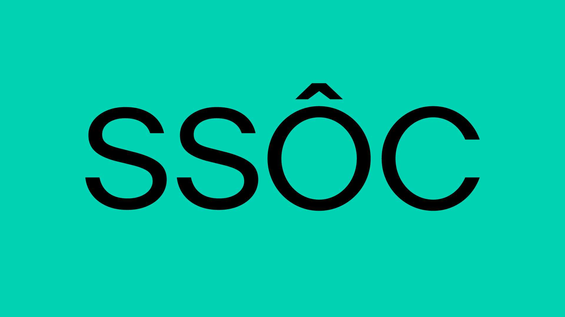
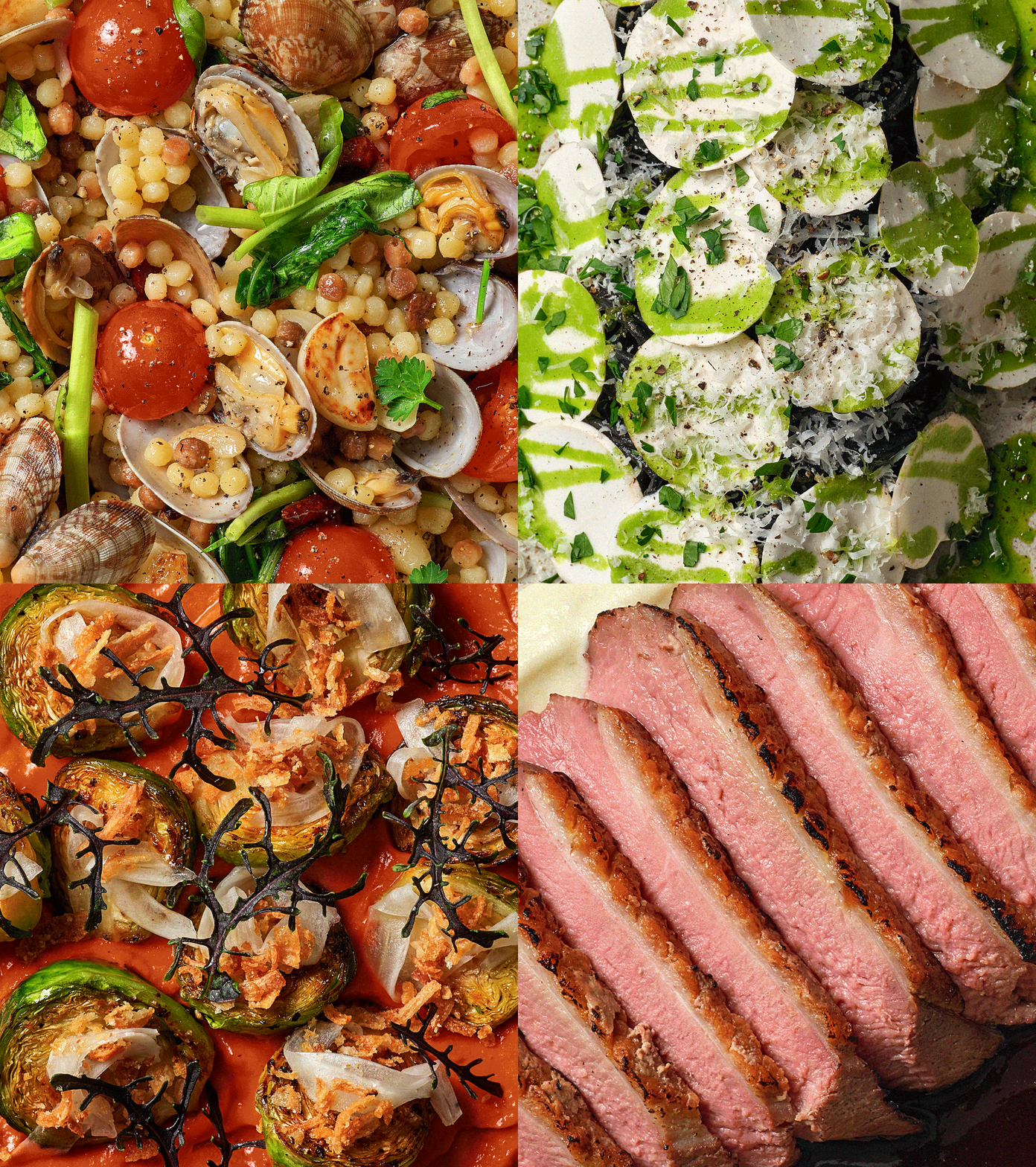
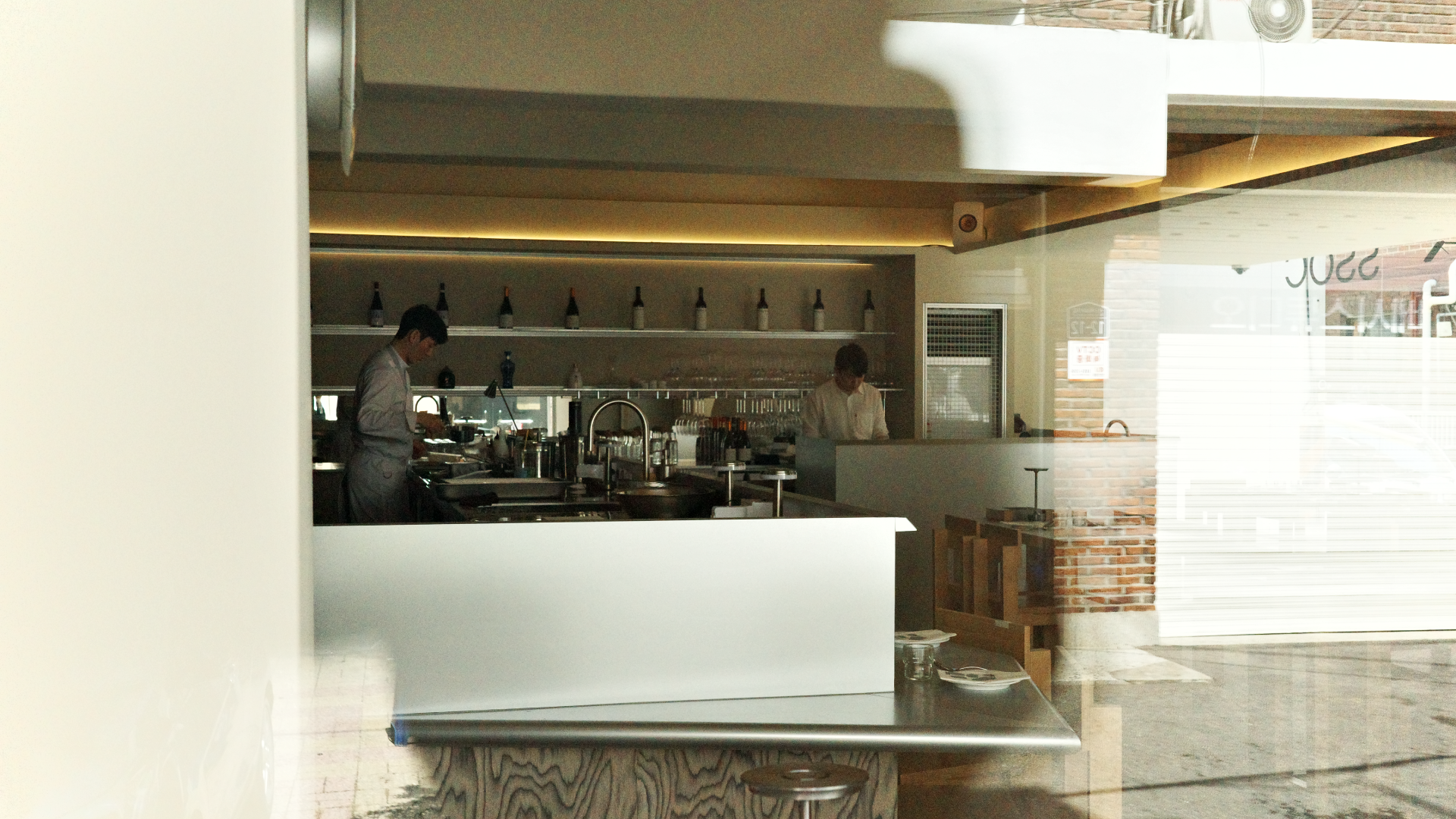
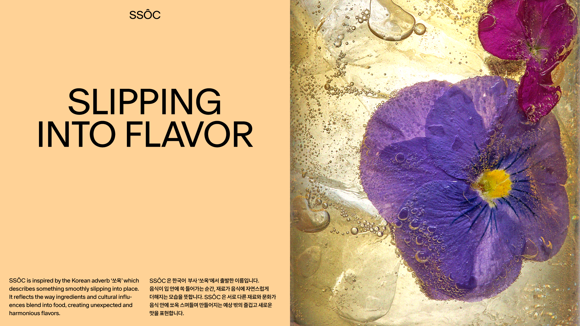
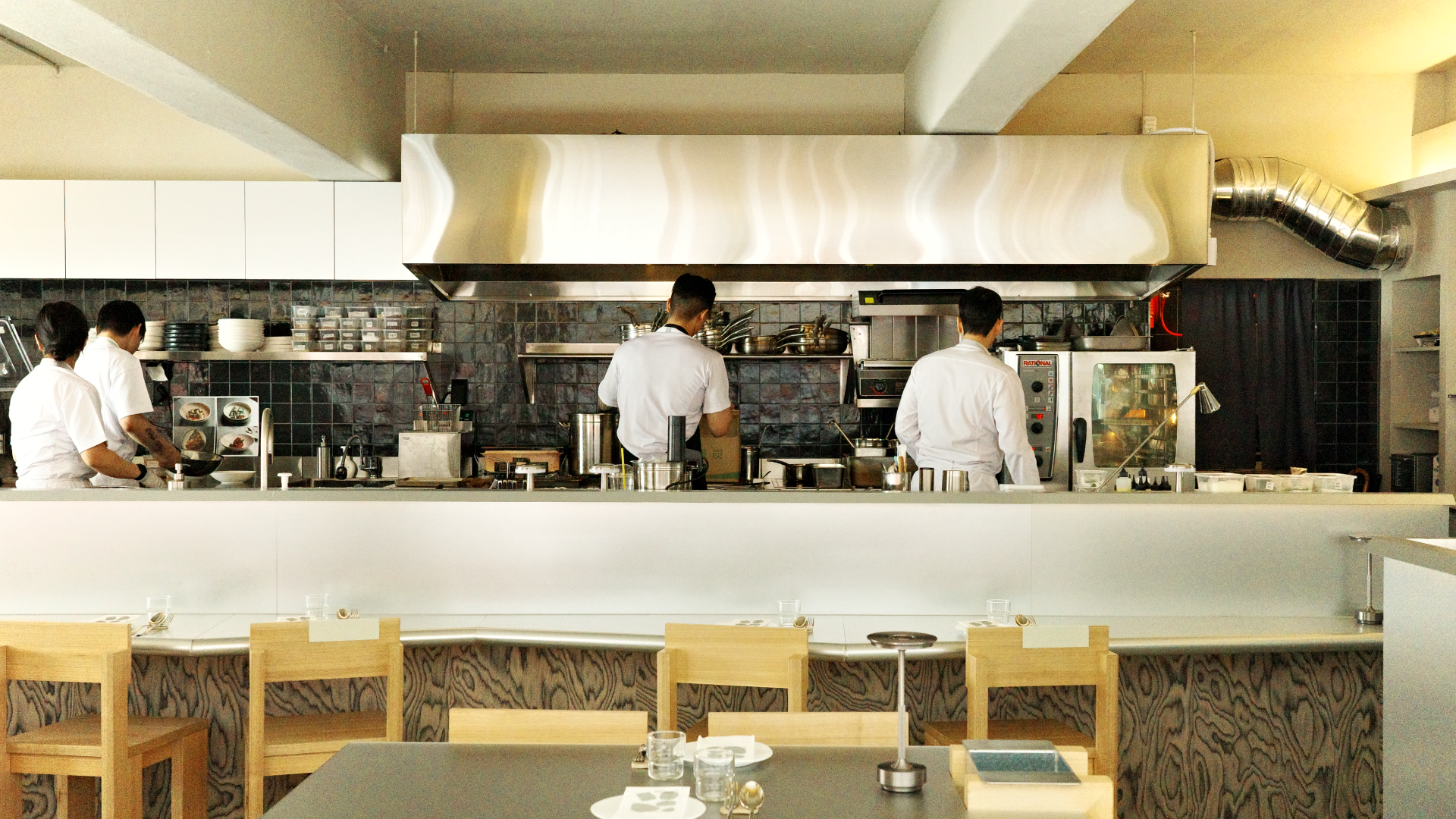




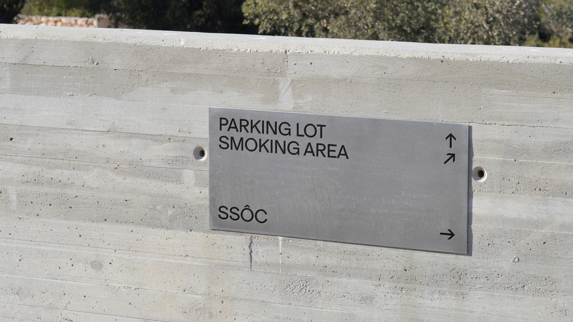
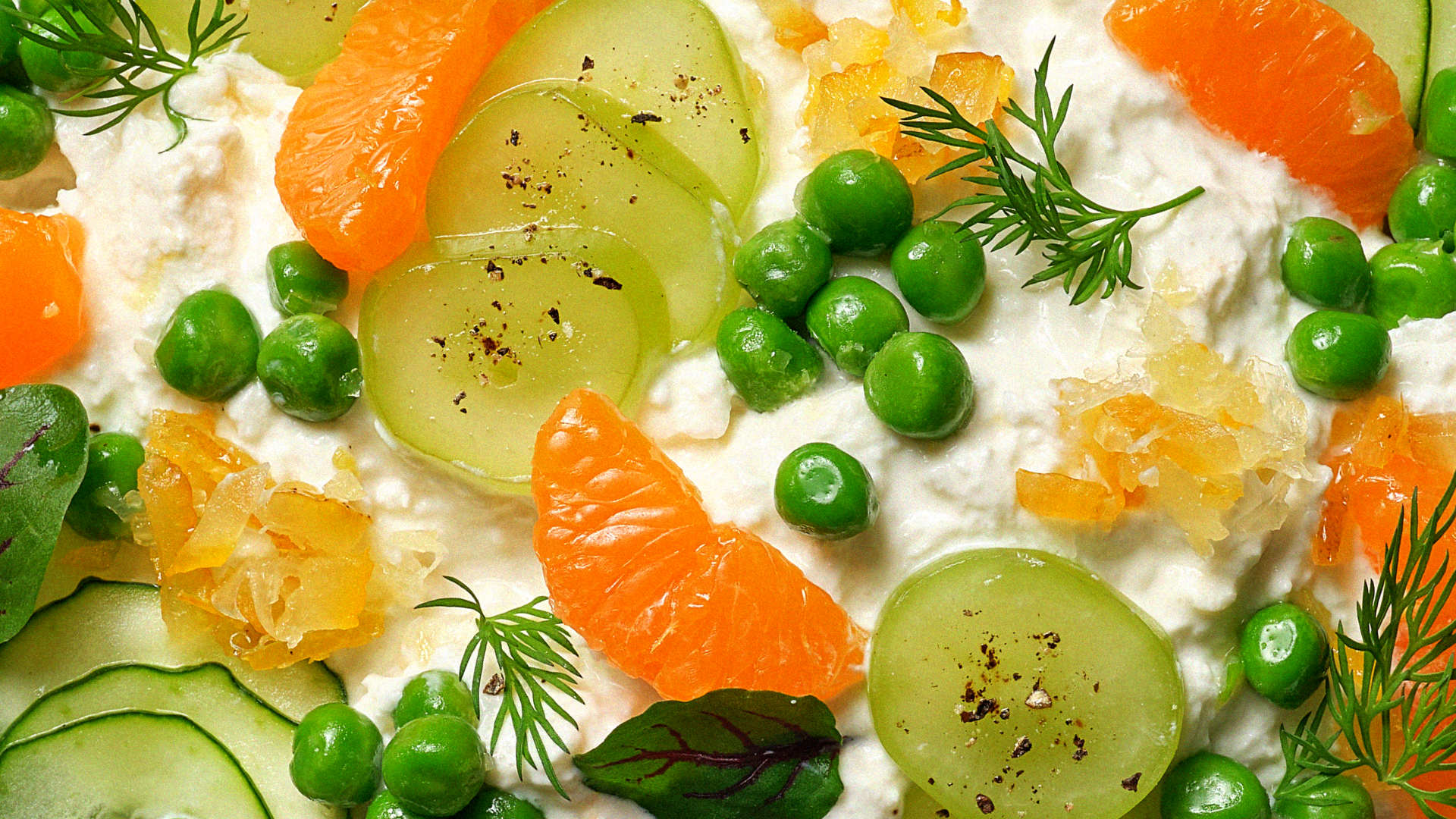

쏘옥(SSÔC)은 '부조화 속의 조화'를 음식으로 풀어내는 아시안 컨템포러리 퀴진입니다. 태그라인 'Twist of Taste'는 이 철학을 영어로 표현한 말로, 아시안 기반의 음식에 유럽의 터치를 더해 낯선 맛의 즐거움을 선사하는 브랜드의 정체성을 함축합니다.
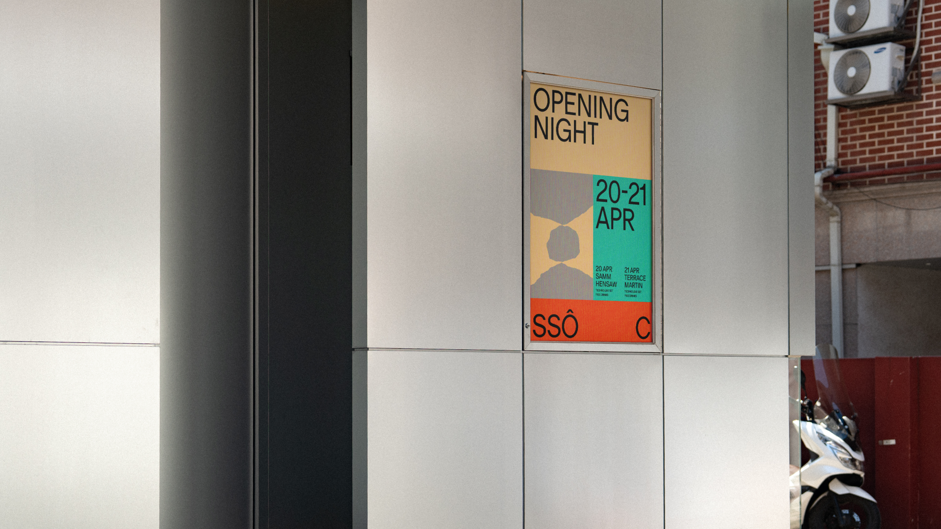
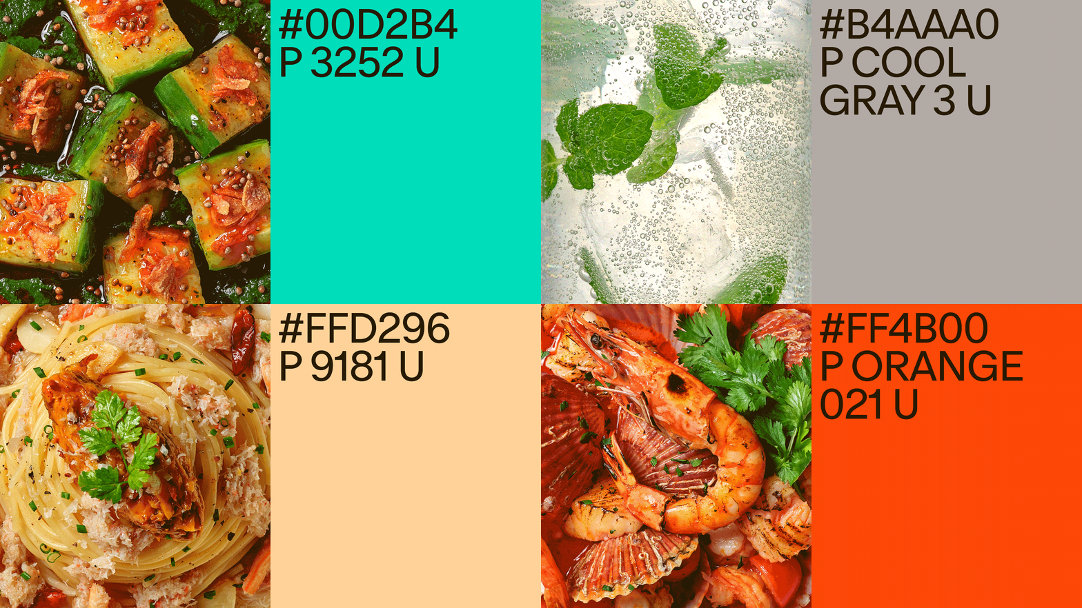
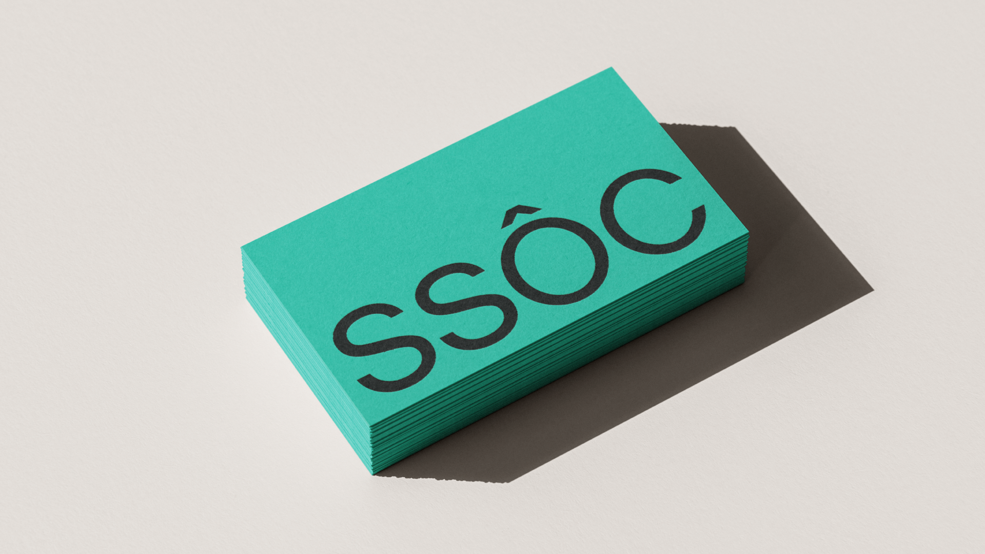
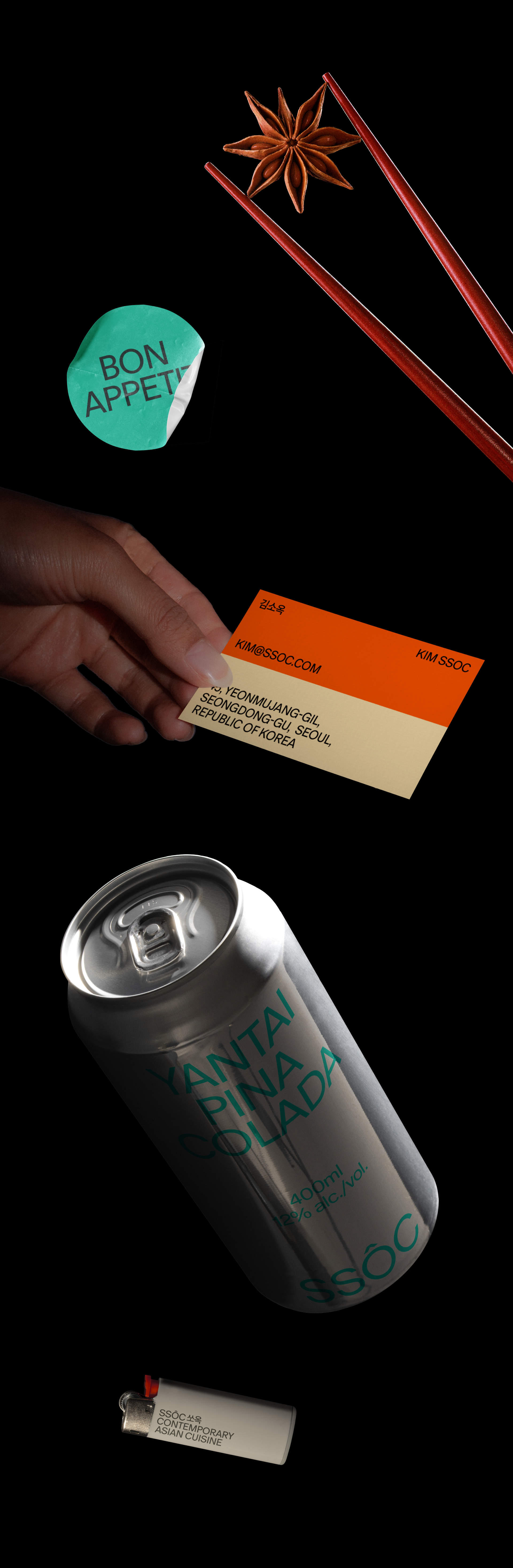
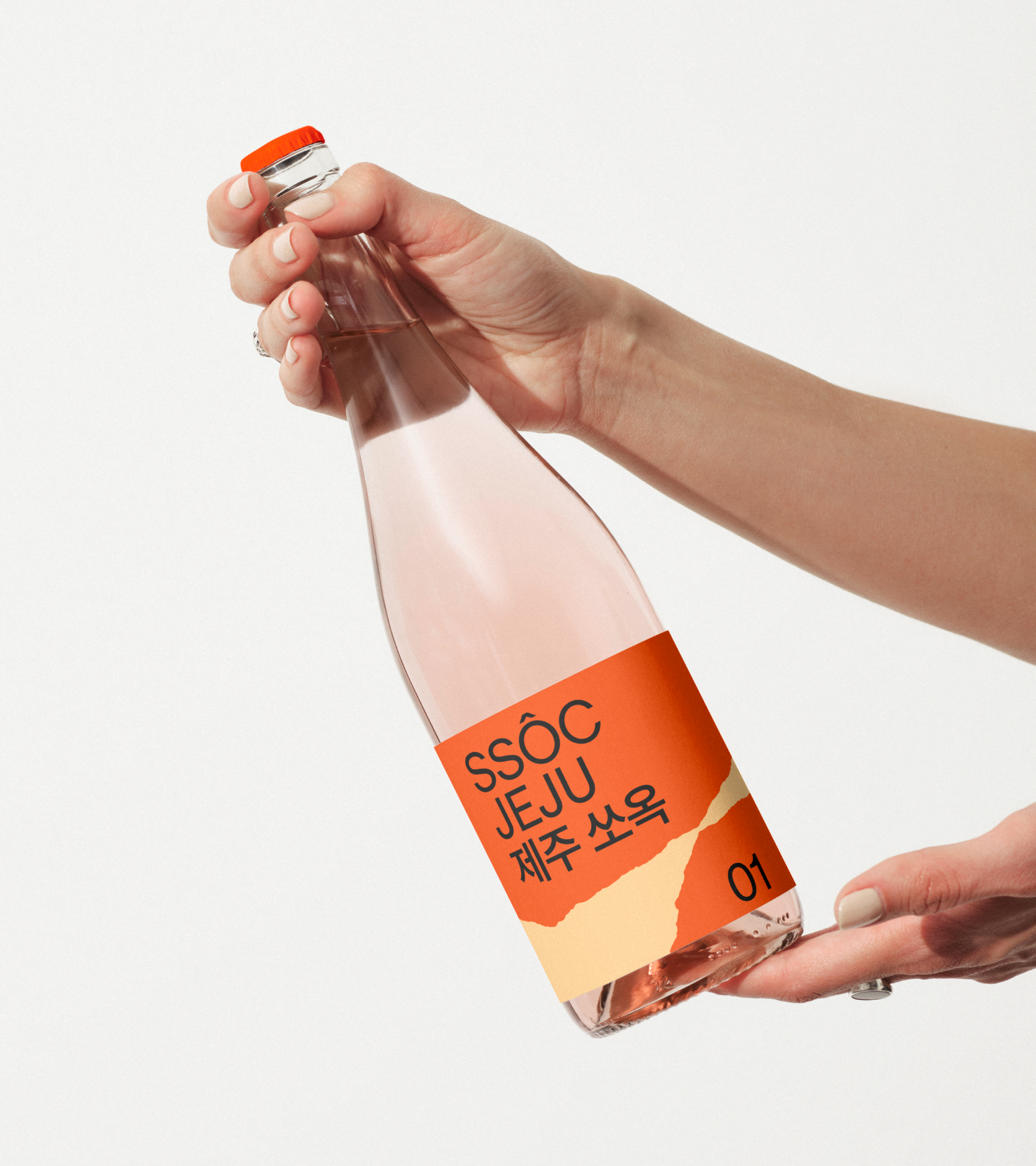
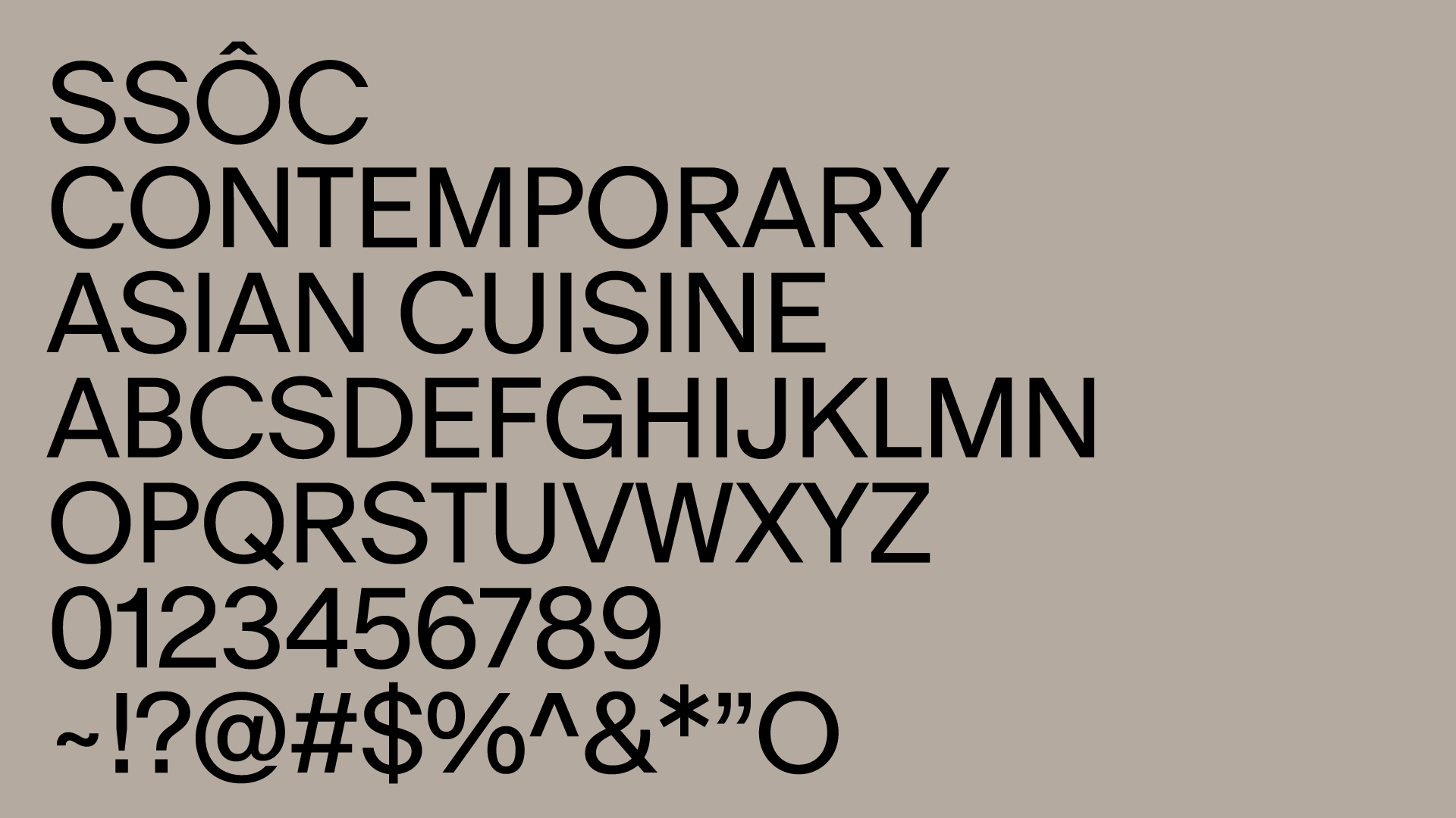
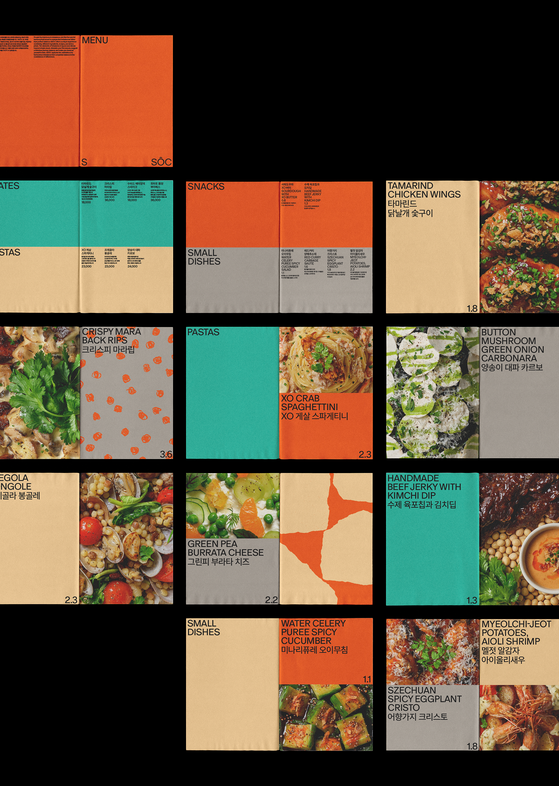
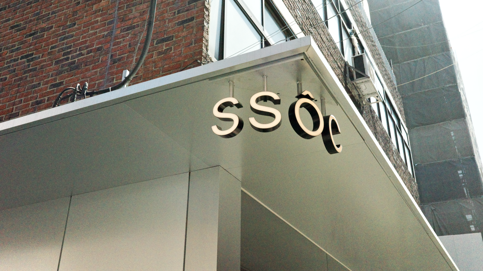
SSÔC의 독특한 경험을 그래픽 패턴과 인상적인 컬러 조합, 볼드 미니멀리즘으로 풀어냈습니다. 기존 네이밍 'SSOC'에 베트남어 모음 'Ô'를 사용해 단어의 발음과 인상을 강조했습니다. 아시아의 감각을 재치 있게 드러내는 동시에, 낯선 알파벳이 주는 호기심을 더합니다.
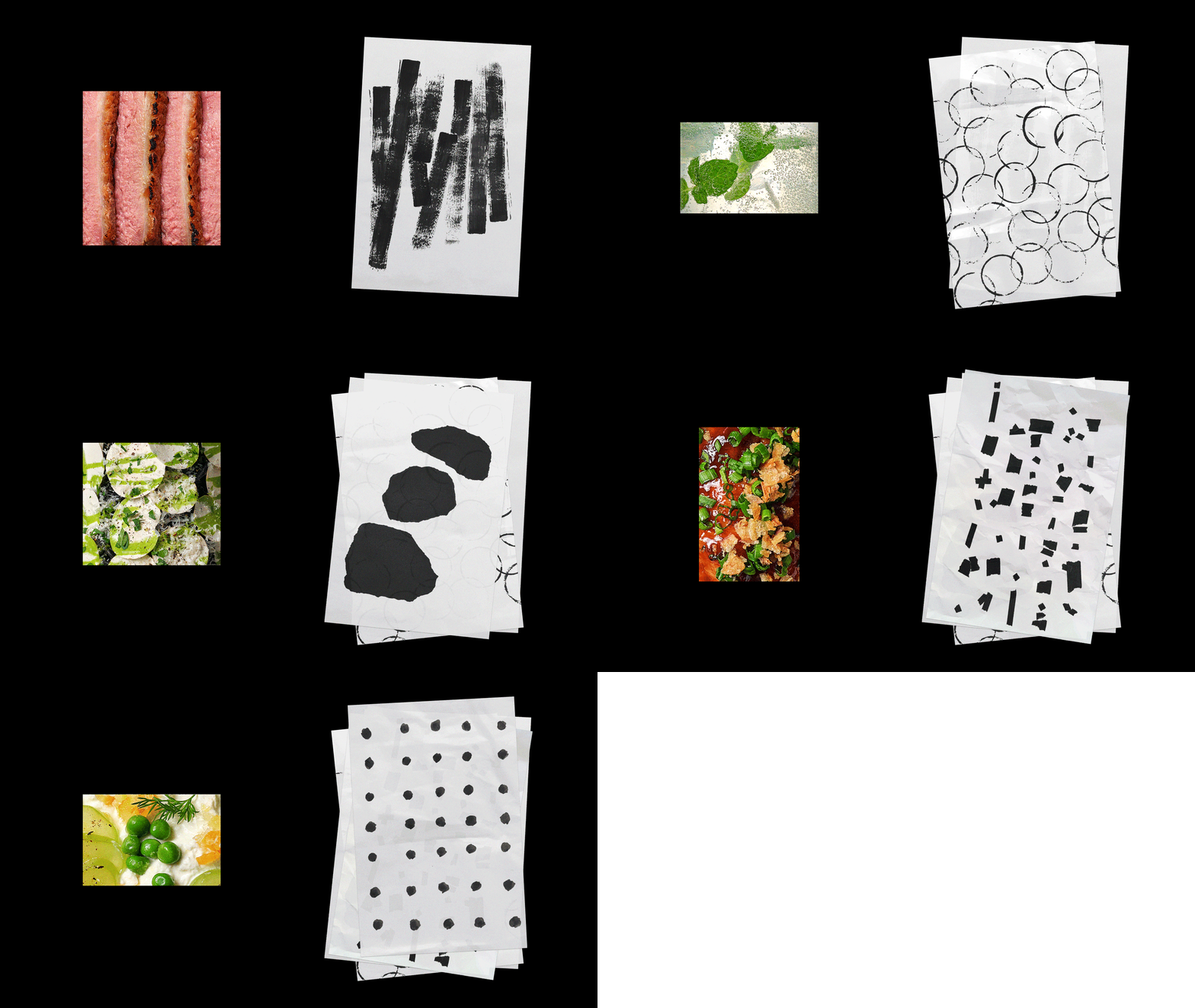
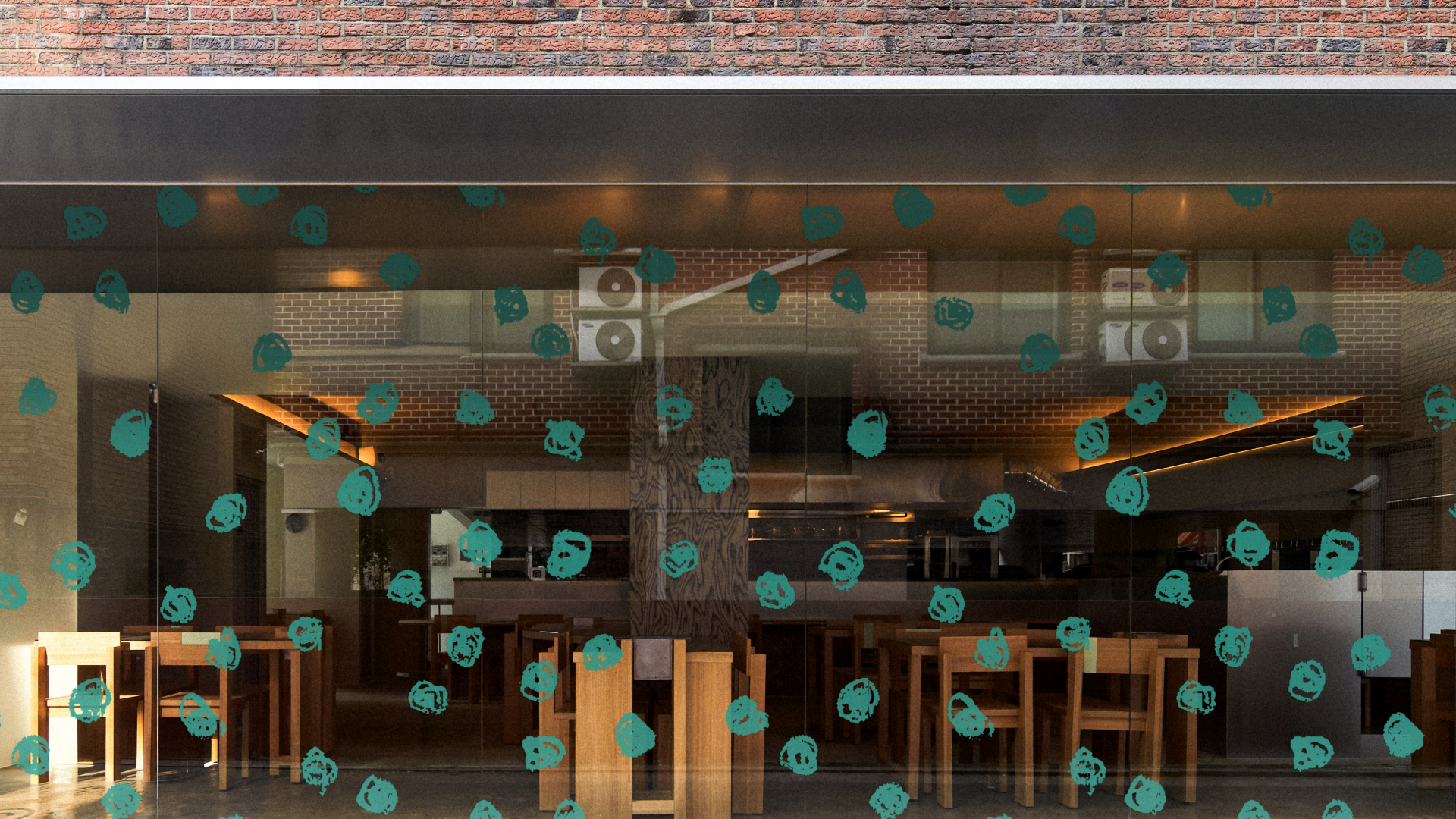
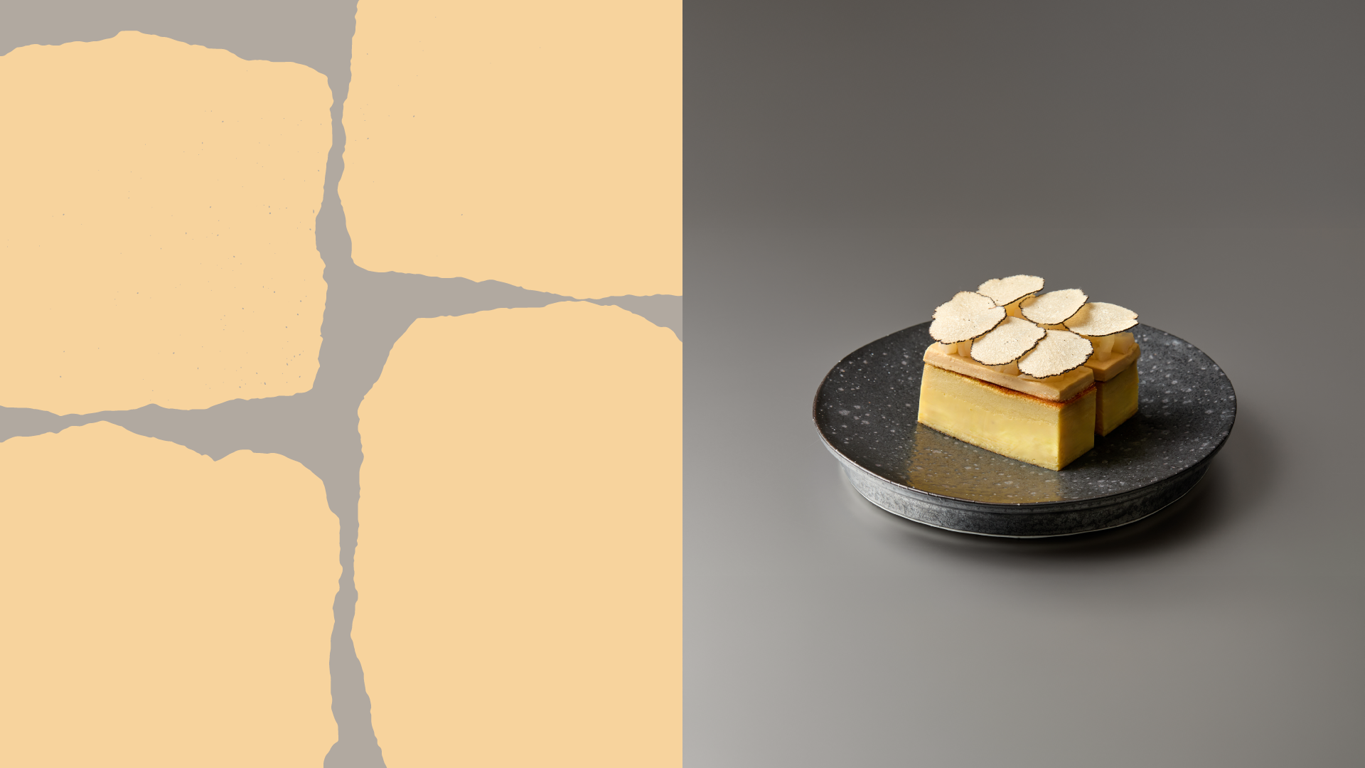
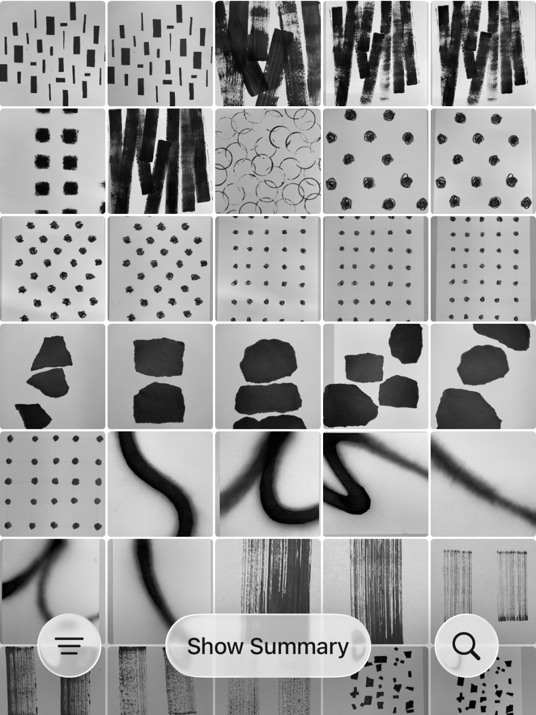
패턴은 요리 재료의 형태에서 영감을 받아 손으로 그린 뒤 그래픽 요소로 정제했습니다. 서로 다른 형태와 강렬한 컬러가 다양한 조합으로 확장되며, 낯설지만 균형 잡힌 비주얼을 통해 '부조화 속의 조화'를 시각적으로 전달합니다.
SSÔC is a contemporary Asian cuisine that translates "Harmony in Dissonance" into food. Its tagline, "Twist of Taste," captures the brand's approach of adding European touches to Asian-based dishes to create unexpected yet delightful combinations.
The visual identity expresses SSÔC through bold minimalism, striking color combinations, and graphic patterns. The Vietnamese vowel "Ô" was introduced to the original name "SSOC" to emphasize its sound and give the wordmark a distinctive character. The unfamiliar letter adds a sense of curiosity while subtly reflecting the brand's Asian roots.
The patterns were inspired by the shapes of ingredients, hand-drawn, and refined into graphic elements. Combined with bold colors, they create a flexible visual system in which contrasting forms come together in balance, visually expressing SSÔC's idea of "Harmony in Dissonance."
Client: Eatout @eatout.works
Creative direction: Changmin Ahn
Project managing: Junbeom Park
Brand identity design: Jiyoon Jung @jung.jiyooon
Motion design: Ratel works @ratel.works
Space design: Design2tone @design2tone_official